So well yeah. This level really was a short one. But it is much better than the other stuff you shared with us so far. However, here's your review:

---

Starting with the gameplay, I must admit this level was actually unexpectedely a bit fun and not boring. Good job ;) Though, there were some passages which really lacked enemies and weren't enjoyable at all. The level was more than easy, almost too easy. Would really fit a 1-1 based level. However, the level was incredibly short, that kills the fun part. That's actually really sad, it had so much potential :| Almost forgot, there wasn't anything you could collect, like dragon coins or stars. But that doesn't really matter at all.
---

Well yeah, design. Something I liked was how you improved your designing skills compared to other levels you made. As mentioned in the gameplay, the lacked NPCs at some spots. Actually, NPCs were missing maaaany times in the level. I could say 1/4 of the level had NPCs and the rest didn't. Focus on that next time, but don't add too much! Anyways, the coin placement could be improved a bit, too. You actually just placed 3x3 squares of coins in the level. Plus, the level had a bad question block placing. Want some examples? There you go:
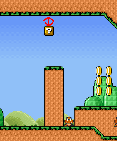
In this screen (Pretty much in the beginning) a question block was placed with only 2 blocks under the "ceiling" (Is that even right? xD). However, this is not really something bad. It's just nitpicking. It causes a glitch to happen and that's something we want to avoid ;) In your future levels, this applies for all blocks actually, not only question blocks.
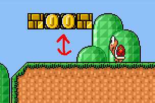
Another example are these guys:
There's just a 2 blocks space between the question blocks and the ground. This is worse than placing a block two blocks under the ceiling, because in here you are screwed if you are an unskilled player and don't know how to perform a "duck-jump" when you are big. In future, leave more room so the player can take on enemies easily without having much skills at all ;) The best would be 3 or 4 blocks, 3 would be average.
And that's it about the question blocks. Oh yeah, don't ever dare to do this again:
Looks just awful and doesn't make any sense. Even for a Mario level. This level was also too short to mention more things, would be great if you prevent doing such short levels ;)
---

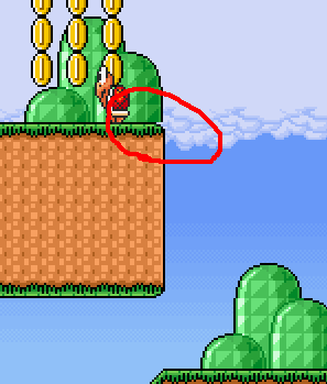
Everything fits together really good. I really liked the use of the tileset in section 2, looked really nice. Would have been nicer if you had mixed it with something, but that's fairly enough. Didn't except that from you to be honest. Anyways, this cut-off should be fixed:
The exit isn't really SMB3-ish, like the rest of the level. But that's no problem at all, at least it doesn't clash ;) And there's the thing with the background the guys here mentioned before, fix that too. That's everything I found, I guess.
---

Fits really good. It's the music this level is based on, so I guess that's enough explanation.
---

The level had many weak points, but it had some strong (Not that strong, either) points, too. As an example the use of the tileset in section 2 was cool, but nothing really special. But the placement of question blocks, coins and NPCs overall was really bad. Plus, the length of the level. It wasn't big, just too short to enjoy it. That's something you should focus on the next time. Music fits and the appereance of this level fits an ordinary SMB3 themed SMBX level.
3.5/10
That's enough for average, congratulations![/center]