
For fucks sake, read this.CD20Superness wrote:ok sorry im working on a new game.practicalshorty014 wrote:But this topic is about level screenshots? So, like those instead?CD20Superness wrote:
I Just Liked The game you know.

|
||||
Perfect SMBX Screenshot Thread 10
Moderator: Userbase Moderators
Re: Perfect SMBX Screenshot Thread 10 |
||
Re: Perfect SMBX Screenshot Thread 10No need for that. Just report the post and we'll deal with it. |
||

Re: Perfect SMBX Screenshot Thread 10 A screenshot of a level I am making |
||

Re: Perfect SMBX Screenshot Thread 10It looks nice and simple. The only thing I don't quite like are the flowers. They seem a little out of place.
|
||

Re: Perfect SMBX Screenshot Thread 10Thanks, I was considering changing the flowers. I may but I dont know yet . Ill probably finish the level yet(I only have about 25% done as of now)
|
||
|
||


Re: Perfect SMBX Screenshot Thread 10Cool, how did you do that in game? |
||
Re: Perfect SMBX Screenshot Thread 10Probably LunaLUA (because of course ) |
||

Re: Perfect SMBX Screenshot Thread 10I know he used lunalua, just what programming? |
||
Re: Perfect SMBX Screenshot Thread 10 Something I just did for an upcomming level of my project. It is still a work in progress, as only the stuff on the screen is done so far. I was wondering how PSX graphics would look when downgraded to my graphical style. It was actually more difficult to do than I expected it to be. :-/ Everything on here is handdrawn, so some stuff might be not 100% accurate. Can you guess what game this is from? ^^ |
||

Re: Perfect SMBX Screenshot Thread 10Wow, those 2-D Rayman like graphics look fantastic!
|
||

Re: Perfect SMBX Screenshot Thread 10It's all blurry and banded. I suggest taking a closer look at the shading of the original sprites:
 |
||

Re: Perfect SMBX Screenshot Thread 10So many childhood memories. I can not wait to play the finalized version of this. I would have to agree with Enjl that some of the tiles are blurry. The Blue Orbs are the graphics that look the worst out of everything here to me. I originally wanted to make a level using these type of graphics three years ago, so it is nice to see this. I would hope Picture City graphics would also be done by you in some way.  |
||

Re: Perfect SMBX Screenshot Thread 10viewtopic.php?f=35&t=18292#p271954 |
||
Re: Perfect SMBX Screenshot Thread 10Thanks. ^^ So you know that game, eh. But I need to change some stuff on these, even though, that will still take awhile, since the level for it will be in world 8 of my project. Then you either need to wear some glasses, or -if you already should wear some- take them off. :-P Yes, that is also a problem that I still need to fix, especially on the slides and the floot. I already got an idea on how to fix this problem, but I will see about it before I utilize these graphics. Yes, this was my first attempt, save for the "Tings" (the blue pearls) that are already an older graphic. I made them too small, but I already also made a bigger version almost twice the size, which I can use and improve, if necessary. About Picture City, there is a chance I do that one too, but no promise on that. ;-P I would like to use this on a giant thwomp, to be honest. Too bad it does not stun the player, as far as I can see it. |
||
Re: Perfect SMBX Screenshot Thread 10Or perhaps you need to reduce the amount of transition colours between dominant shades on your sprite. You have a tendency to use many more colours than necessary to achieve what you're trying to portrait, and more often than not it ends up looking like someone applied a blur filter to a decently shaded sprite.  This area in particular could have been drawn by using a bright and dark colour and applying a blur filter to do the rest. |
||
Re: Perfect SMBX Screenshot Thread 10Umm, looking at the lua code he linked, it does stun the player. |
||
Re: Perfect SMBX Screenshot Thread 10Logically speaking, you're right, but it seems to me like Rayman does exactly what you're disliking. |
||

Re: Perfect SMBX Screenshot Thread 10Kinda in some places but also not really? Like in the screen I posted above there is banding like this present on the blue tubes, but I think there's a distinct difference between Sednaiur's interpretation and the original sprites. Namely a stronger contrast for the highlight and shadow colours that help lift it off the gradient-y shading and highlight the important colours on the sprite. Also it has a green backlighting but that's only marginally related. Here's another example of what I mean: 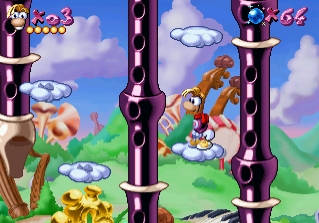 The highlights and metallic shade are displayed much better than on Sednaiur's sprites that, in comparison, display a much less polished and reflective material. |
||
Re: Perfect SMBX Screenshot Thread 10Listen, Enjl-chan ^^ I like to thank you for your opinion, critism and suggestions here. And as I already meant to say with my previous post, I understand your point and already knew about the flaws of my graphics before. I will also take into consideration what others said. But please, understand one thing. I said the following in my first post: "I was wondering how PSX graphics would look when downgraded to my graphical style."! That was not meant to say that I like to copy it like 1:1 for every possible detail. That would not be possible easily, as Rayman utilizes a 24x24 grid if one so wants. So that is a space of 150% the size that SMBX uses (and other PSX games do use that ratio also). I looked onto the very same screens you provided here(and exactly two more :-P), for around 6 hours of total time. In that time, I did not just work onto the graphics themselves (and edit them several more times) but also decided what details I change in favor of my style (like not using almost black brightness for any hue provided on the original graphics) what details I may keep or need to drop completely (like the way the top and bottom skins of the drums are attached to the drumbarrel, what to do/not to do at the floot-graphics), aswell as what I can add to make it more custom. ^^ And yes, I know about all the banding and possible blurness. I am not satisfied with it, either, which made me say "Yes, that is also a problem that I still need to fix". But now to my point: I am working hard on my stuff, even if it is far from being professional, and most people like it, no matter if they are correct in your eyes, or not. I get rarely the time to come online more than around once every 10th day or so, which is of course not your problem. But do you really think that I like to get in an argument with you or anyone else in such spare time, just because of such trivial problems like this (and especially in the Invasion 3-thread, for the checkpoint-issue), when we both have obviously better things to do? ^^ If you are really so serious about being so professional in about every detail, then I suggest you to either visit places like "Kickstarter" to host your own real game project, or maybe getting hired by a huge game software company, rather than hanging out with us "unprofessionals" here. I am not trying to force you or anything, as it is always nice to have some other interested and devoted people around here, really. And you sure help the community out with your participation on SMBX 2.0 ^^ But do me, yourself, and also others a favor, please. If you give critism, only do it if you really like to help, and not possibly to release steam. It really looks to me, that this is your main propelling force on here. Let's be nice and not repeat what you did to me around 20 months ago, okay? It will get you nothing. :-P |
||
Who is online
Users browsing this forum: No registered users and 2 guests


