Let me give you some feedback on this.
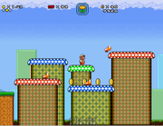
Firstly, you should know that the different games have very different styles. Mixing them together is sometimes really difficult without making things look strange [well to be honest, even Nintendo did it A LITTLE BIT wrong with the e-reader levels sometimes IMHO].
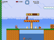
For instance I see a SMB3 goomba and a SMB2 Shy guy. SMB3 has more grayish colors, SMW has fewer colors, but the colors are more powerful.
If you don`t know what I mean, check out a few original examples here:
https://vgmaps.com/Atlas/SuperNES/index ... MarioWorld
https://vgmaps.com/Atlas/SuperNES/index ... ioAllStars
On the last picture also I see a lot of "just filled with a repeating" tile stuff. If you do stuff like that, please make sure, it does not look too bland.
If you are able to work with colors (to make looks more matching with each other) and a graphic programm, I suggest you something like this here to work with:
https://mfgg.net/index.php?act=resdb&pa ... 1&id=30023
Actually we have a screenshots thread somewhere where people can show their work without opening a new thread on their own... but ... I can not find it again... uhm.. otherwise I would have shown you some examples.