Re: Screenshots Thread v2
Posted: Sat Aug 09, 2014 11:48 pm
Looks nice. Though the size of the grass on the slopes and upside down tiles are a lot smaller. Other than that it looks great. By the way, I'd suggest you adding shading to those symbols on the fill, it just looks out of place without it.KoolKat wrote:My new tileset. It's for the first in-pyramid level in SMPM.Spoiler: show

The different thickness of grass is intentional. The grass on top gets more rainfall, and therefore grows more abundantly. Also, the symbols are shaded, if you look closely it'll be easier to tell.Natsu wrote:Looks nice. Though the size of the grass on the slopes and upside down tiles are a lot smaller. Other than that it looks great. By the way, I'd suggest you adding shading to those symbols on the fill, it just looks out of place without it.
Its beroken. The screen I mean.KoolKat wrote:[img][IMG]http://i.imgur.com/ZGO4mfh.png[/img][/img]
Here's a level I've finished already. However, I was saving it for CC9 until a few weeks ago, when I made a level WAYYYYY better, and decided I'd rather have good placement.
The different thickness of grass is intentional. The grass on top gets more rainfall, and therefore grows more abundantly. Also, the symbols are shaded, if you look closely it'll be easier to tell.Natsu wrote:Looks nice. Though the size of the grass on the slopes and upside down tiles are a lot smaller. Other than that it looks great. By the way, I'd suggest you adding shading to those symbols on the fill, it just looks out of place without it.
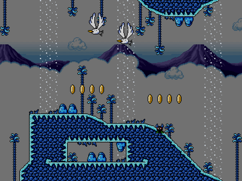
Looks utterly amazing.AirShip wrote:5-7 Blizzard Blast:Spoiler: show
Fixed.Superiorstar wrote:Its beroken. The screen I mean.KoolKat wrote:[/img]
Here's a level I've finished already. However, I was saving it for CC9 until a few weeks ago, when I made a level WAYYYYY better, and decided I'd rather have good placement.
The different thickness of grass is intentional. The grass on top gets more rainfall, and therefore grows more abundantly. Also, the symbols are shaded, if you look closely it'll be easier to tell.Natsu wrote:Looks nice. Though the size of the grass on the slopes and upside down tiles are a lot smaller. Other than that it looks great. By the way, I'd suggest you adding shading to those symbols on the fill, it just looks out of place without it.
I got hit, so I was in the flashing animation.ShadowNinja wrote:This level looks nice, butRadishl wrote:Heres some screenies non project wise.
Making a level that tells a tale.
It is what Toad does when he isnt adventuring with Mario and the gang.
Oh did I also tell you I fell in love with Raster's graphic pack?Spoiler: showwhere are Toad?Spoiler: show
Ninja Immortal Toad Mode.Radishl wrote:I got hit, so I was in the flashing animation.
Why is it called Blizzard blast if I can barely see any snowfall?AirShip wrote:5-7 Blizzard Blast:Spoiler: show
Oh yeah. This explain everything.Radishl wrote:I got hit, so I was in the flashing animation.
This is only a part of the level, many things can still happen.Superiorstar wrote:Why is it called Blizzard blast if I can barely see any snowfall?AirShip wrote:5-7 Blizzard Blast:Spoiler: show
you should think of the name that fits with the level.
Superiorstar wrote:Why is it called Blizzard blast if I can barely see any snowfall?AirShip wrote:5-7 Blizzard Blast:Spoiler: show
you should think of the name that fits with the level.
I wonder why people use alliteration for naming levels.KoolKat wrote:Superiorstar wrote:Why is it called Blizzard blast if I can barely see any snowfall?AirShip wrote:5-7 Blizzard Blast:Spoiler: show
you should think of the name that fits with the level.
I'm sure we all do this at some point, just for the alliteration.
For example:
Athletic Alley (that was this sky level I reviewed back on NSMBX)
No alleys involved
I'd be willing to chalk it up to SMSE copying that, and then people copying SMSERadishl wrote: I wonder why people use alliteration for naming levels.
Mario galaxy?
If I am you, I wouldn't show any kind of details on your Level that has to do with our Community Contest Events.Valtries the Fox wrote:Two screenies of my upcoming CC9 level:Spoiler: show
Looks a bit boring. I guess you have to recolor the mushrooms in the second screen.Valtries the Fox wrote:Two screenies of my upcoming CC9 level:
Spoiler: show
You're not supposed to reveal details about your community contest levels. If you enter that level into CC9, you'll get disqualified I believe.Valtries the Fox wrote:Two screenies of my upcoming CC9 level:
Spoiler: show
Is this better?Christian07 wrote:Looks a bit boring. I guess you have to recolor the mushrooms in the second screen.Valtries the Fox wrote:Two screenies of my upcoming CC9 level:
Spoiler: show
Well I guess I'll just post this level on the board and make some shitty level using some tileset.Kep wrote:Valtries the Fox wrote:
Two screenies of my upcoming CC9 level:
Spoiler: show
You're not supposed to reveal details about your community contest levels. If you enter that level into CC9, you'll get disqualified I believe.
Regardless, it looks all right. However, the SMB3-styled Toad and weirdly colored mushrooms are out of place.