Page 26 of 71
Re: Mario and Luigi's house from Superstar Saga (WIP)
Posted: Mon Nov 12, 2018 11:03 am
by Eri7
The Graphics are nice, its interesting when people make 2d version of graphics meant to be potrayed as 2.5D/3D. I am excited for more updates, good job!
Re: Mario and Luigi's house from Superstar Saga (WIP)
Posted: Mon Nov 12, 2018 8:48 pm
by Lemlime25
Eri7 wrote:
The Graphics are nice, its interesting when people make 2d version of graphics meant to be potrayed as 2.5D/3D. I am excited for more updates, good job!
MarioRPGExpert93 wrote: ↑Mon Nov 12, 2018 7:49 am
Now that's a Background image that's 100% faithful to the original source from the hit 32-bit GBA Game:
Mario & Luigi RPG 1!
Thanks guys! Your kind words means a lot to me :)
Re: Mario and Luigi's house from Superstar Saga (WIP)
Posted: Tue Nov 13, 2018 5:12 am
by PopYoshi
At first I wasn't convinced but now it looks kinda like the original! keep up the good work!
Re: Mario and Luigi's house from Superstar Saga (WIP)
Posted: Tue Nov 13, 2018 3:50 pm
by Lemlime25
Update 2
I added the kitchen and also altered the colours of the fence, stairs, and bathroom tiles to better match the original. I can't post any screenshots at the moment, but I'll add one to this message once I can!
Edit: Here's a screenshot. Also, I might move the kitchen around a little bit later as I'm not really sure where the best place to put it is.

Re: WIP Graphics Showcase III
Posted: Thu Nov 15, 2018 10:17 pm
by KBorg64
Enjl wrote: ↑Sun Nov 11, 2018 6:15 am
Posting wip graphics is really hard if you're done after half an hour.
So here's just something that didn't exist earlier today and was done without any specific use cases in mind.
Darkonius found a use for it though so that's good.

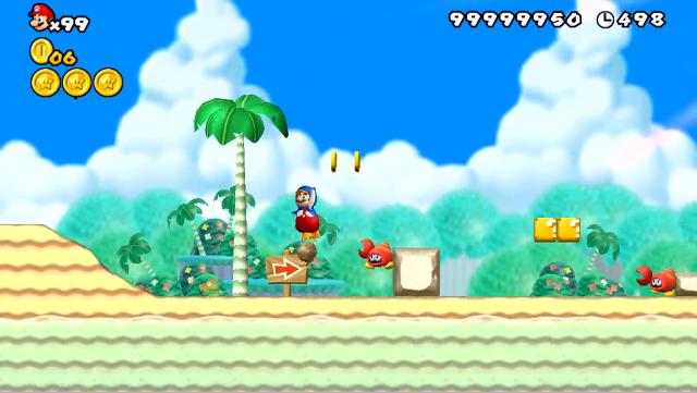
Well done sprite work! I can't find any negatives or needed improvements to it. It's a simple crab-type enemy, and it's great. I'm guessing it's meant to replace the hammer bro? Great sprite, I hope to use in an episode someday.
Re: WIP Graphics Showcase III
Posted: Fri Nov 16, 2018 1:12 am
by Emral
64searchman46 wrote: ↑Thu Nov 15, 2018 10:17 pm
Enjl wrote: ↑Sun Nov 11, 2018 6:15 am
Posting wip graphics is really hard if you're done after half an hour.
So here's just something that didn't exist earlier today and was done without any specific use cases in mind.
Darkonius found a use for it though so that's good.

Well done sprite work! I can't find any negatives or needed improvements to it. It's a simple crab-type enemy, and it's great. I'm guessing it's meant to replace the hammer bro? Great sprite, I hope to use in an episode someday.

Not meant to replace anything. The frames present are meant to provide everything necessary to make replicating the original AI possible.
Re: WIP Graphics Showcase III
Posted: Mon Nov 19, 2018 7:54 am
by FireyPaperMario
And yeah, I still have penlty time to work on my
SEGA Genesis/Mega Drive custom Graphics.


What's new added so far:
- A hill BGO that i made a 16-bit version based off of Super Mario Land 2: 6 Golden Coins
- A poorly designed 16-bit tree that I tried to add some creative textures to, but failed!

- Part of a tree graphic that is there, can be used a ropes if y'all want!
Anything I need to improve on?

Re: WIP Graphics Showcase III
Posted: Mon Nov 19, 2018 8:11 am
by PixelPest
MarioRPGExpert93 wrote: ↑Mon Nov 19, 2018 7:54 am
And yeah, I still have penlty time to work on my
SEGA Genesis/Mega Drive custom Graphics.


What's new added so far:
- A hill BGO that i made a 16-bit version based off of Super Mario Land 2: 6 Golden Coins
- A poorly designed 16-bit tree that I tried to add some creative textures to, but failed!

- Part of a tree graphic that is there, can be used a ropes if y'all want!
Anything I need to improve on?

Excessive dithering constitutes creative shading? Also why does the tree trunk have a green highlight?
Similarly, the shading on the hills, excluding the highlight, does not make them look very round
Re: WIP Graphics Showcase III
Posted: Mon Nov 19, 2018 8:14 am
by FireyPaperMario
PixelPest wrote: ↑Mon Nov 19, 2018 8:11 am
Excessive dithering constitutes creative shading? Also why does the tree trunk have a green highlight?
I tried to recreate the tree trunk design from
Sonic 1 using the Mega Drive color palette.
Re: WIP Graphics Showcase III
Posted: Mon Nov 19, 2018 8:37 am
by PixelPest
MarioRPGExpert93 wrote: ↑Mon Nov 19, 2018 8:14 am
PixelPest wrote: ↑Mon Nov 19, 2018 8:11 am
Excessive dithering constitutes creative shading? Also why does the tree trunk have a green highlight?
I tried to recreate the tree trunk design from
Sonic 1 using the Mega Drive color palette.
It still doesn't look good though
Re: WIP Graphics Showcase III
Posted: Mon Nov 19, 2018 8:45 am
by FireyPaperMario
PixelPest wrote: ↑Mon Nov 19, 2018 8:37 am
MarioRPGExpert93 wrote: ↑Mon Nov 19, 2018 8:14 am
PixelPest wrote: ↑Mon Nov 19, 2018 8:11 am
Excessive dithering constitutes creative shading? Also why does the tree trunk have a green highlight?
I tried to recreate the tree trunk design from
Sonic 1 using the Mega Drive color palette.
It still doesn't look good though
For today's
SMXB standards, yeah, it doesn't look that good outside
SMB3 style... But I was trying to take inspiration from gfx from other games!
Re: WIP Graphics Showcase III
Posted: Mon Nov 19, 2018 8:51 am
by PixelPest
MarioRPGExpert93 wrote: ↑Mon Nov 19, 2018 8:45 am
PixelPest wrote: ↑Mon Nov 19, 2018 8:37 am
MarioRPGExpert93 wrote: ↑Mon Nov 19, 2018 8:14 am
I tried to recreate the tree trunk design from
Sonic 1 using the Mega Drive color palette.
It still doesn't look good though
For today's
SMXB standards, yeah, it doesn't look that good outside
SMB3 style... But I was trying to take inspiration from gfx from other games!
I never said anything about SMB3 or SMBX though. Just in general it doesn't look good. The highlight is really saturated and unfitting especially with the way you've constructed the rest of the tileset.
Similarly the palette and shading of the pillar makes it looks very much more like a bulbous laser
Re: WIP Graphics Showcase III
Posted: Mon Nov 19, 2018 8:52 am
by FireyPaperMario
PixelPest wrote: ↑Mon Nov 19, 2018 8:51 am
I never said anything about SMB3 or SMBX though. Just in general it doesn't look good. The highlight is really saturated and unfitting especially with the way you've constructed the rest of the tileset
Okay, I'll change the trunk highlight once i get the time.
Re: WIP Graphics Showcase III
Posted: Mon Nov 19, 2018 8:55 am
by PixelPest
MarioRPGExpert93 wrote: ↑Mon Nov 19, 2018 8:52 am
PixelPest wrote: ↑Mon Nov 19, 2018 8:51 am
I never said anything about SMB3 or SMBX though. Just in general it doesn't look good. The highlight is really saturated and unfitting especially with the way you've constructed the rest of the tileset
Okay, I'll change the trunk highlight once i get the time.
The pillar also needs work which I edited my post above to mention. The general shape of it is also a little wonky
Re: WIP Graphics Showcase III
Posted: Mon Nov 19, 2018 9:19 am
by FireyPaperMario
PixelPest wrote: ↑Mon Nov 19, 2018 8:55 am
The pillar also needs work which I edited my post above to mention. The general shape of it is also a little wonky
You're talking about the red vase graphic or the graphic used for the tall Mushroom?
Re: WIP Graphics Showcase III
Posted: Mon Nov 19, 2018 9:23 am
by PixelPest
MarioRPGExpert93 wrote: ↑Mon Nov 19, 2018 9:19 am
PixelPest wrote: ↑Mon Nov 19, 2018 8:55 am
The pillar also needs work which I edited my post above to mention. The general shape of it is also a little wonky
You're talking about the red vase graphic or the graphic used for the tall Mushroom?
I guess it's a vase then, but that's hard to tell and the palette needs some work as right now it looks like a laser
Re: WIP Graphics Showcase III
Posted: Mon Nov 19, 2018 5:30 pm
by FireyPaperMario
PixelPest wrote: ↑Mon Nov 19, 2018 9:23 am
but that's hard to tell and the palette needs some work as right now it looks like a laser
I guess i need more room for improvement then. Guess I should go examine the different Mega Drive graphics on the
YouTube and/or play some Genesis games.
Re: WIP Graphics Showcase III
Posted: Tue Nov 20, 2018 5:29 am
by Emral
MarioRPGExpert93 wrote: ↑Mon Nov 19, 2018 5:30 pm
PixelPest wrote: ↑Mon Nov 19, 2018 9:23 am
but that's hard to tell and the palette needs some work as right now it looks like a laser
I guess i need more room for improvement then. Guess I should go examine the different Mega Drive graphics on the
YouTube and/or play some Genesis games.
Look at vases too.
Re: WIP Graphics Showcase III
Posted: Tue Nov 20, 2018 11:37 am
by Taycamgame
Maybe even making it just a darker colour such as dark red or light brown would get rid of the "laser effect".
Re: WIP Graphics Showcase III
Posted: Tue Nov 20, 2018 12:12 pm
by FireyPaperMario
Taycamgame wrote: ↑Tue Nov 20, 2018 11:37 am
Maybe even making it just a darker colour such as dark red or light brown would get rid of the "laser effect".
Okay, I'll keep this in thought whenever i go back to editing my GFX


