Page 23 of 99
Re: WIP Graphics Showcase 2
Posted: Wed Nov 18, 2015 9:04 pm
by Emral
TheKingOfBoos wrote:Enjl wrote:I think the pupils should in general be a tad smaller. If I was a player breezing past this enemy I'd think this is a cyborg pokey.
Please make a cyborg pokey someone. The world needs this.
On it. Stay tuned.
No I meant someone who already has developed a sense for colouring and sha-
ah geez.
Re: WIP Graphics Showcase 2
Posted: Wed Nov 18, 2015 9:05 pm
by TheKingOfBoos
Enjl wrote:TheKingOfBoos wrote:Enjl wrote:I think the pupils should in general be a tad smaller. If I was a player breezing past this enemy I'd think this is a cyborg pokey.
Please make a cyborg pokey someone. The world needs this.
On it. Stay tuned.
No I meant someone who already has developed a sense for colouring and sha-
ah geez.
Eeeyyyy now I'm getting better slowly and surely
Darnit Enjl someday I'm gonna prove you wrong

Re: WIP Graphics Showcase 2
Posted: Wed Nov 18, 2015 9:33 pm
by Emral
Welp. My attempt turned into an absolute mess.
http://i.imgur.com/VWS5Y6b.png
Re: WIP Graphics Showcase 2
Posted: Wed Nov 18, 2015 9:45 pm
by TheKingOfBoos
Meh. It's actually kinda cute. Good job! probably better than what I could do.
Re: WIP Graphics Showcase 2
Posted: Wed Nov 18, 2015 9:51 pm
by PROX
Terminator Pokey much? xD Anyway it looks pretty good, but I can see how difficult it is as far as adding a bunch of detail to a small sprite.
Re: WIP Graphics Showcase 2
Posted: Thu Nov 19, 2015 1:15 am
by DarkWolf658
Welp, here is something i started

I was inspired by this
http://www.duelinganalogs.com/article/t ... never-was/
Re: WIP Graphics Showcase 2
Posted: Thu Nov 19, 2015 2:09 am
by PROX
It looks like you increased the contrast
Re: WIP Graphics Showcase 2
Posted: Thu Nov 19, 2015 2:45 am
by DarkWolf658
I actually used only nes colors to recreate the tiles. Im goin to try to use only nes colors and remake all smb3 tiles. The link I posted tells you more info.
Re: WIP Graphics Showcase 2
Posted: Fri Nov 20, 2015 5:23 pm
by PixelPest
A little something new. Still needs a bit of tweaking but it's come a long way.

Re: WIP Graphics Showcase 2
Posted: Fri Nov 20, 2015 6:11 pm
by TheKingOfBoos
PixelPest wrote:A little something new. Still needs a bit of tweaking but it's come a long way.

Kewl little gear enemy? What's it for? What theme of level, I mean?
Re: WIP Graphics Showcase 2
Posted: Fri Nov 20, 2015 6:34 pm
by Emral
PixelPest wrote:A little something new. Still needs a bit of tweaking but it's come a long way.

The contrast between the brightest and second brightes colour could be higher. Aside from that, looking cool!
Also nice pilowshading. Kappa.
Re: WIP Graphics Showcase 2
Posted: Fri Nov 20, 2015 6:45 pm
by PixelPest
TheKingOfBoos wrote:Kewl little gear enemy? What's it for? What theme of level, I mean?
It is a gear! It's for a factory/castle level.
Enjl wrote:The contrast between the brightest and second brightes colour could be higher. Aside from that, looking cool!
Enjl Also Secretly wrote:Also nice pilowshading. Kappa.
Thanks for the suggestion. And yes, it is pillowshaded in the center, but I thought it was a little bit too small to do much else with and have a good result.
Re: WIP Graphics Showcase 2
Posted: Tue Nov 24, 2015 8:16 pm
by PROX
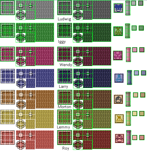
Well I've been working on something big. Just take a wild guess what this is. (BTW they won't be designed to be used together)
Re: WIP Graphics Showcase 2
Posted: Tue Nov 24, 2015 8:17 pm
by HenryRichard
That's pretty cool looking, and the palettes are good.
Re: WIP Graphics Showcase 2
Posted: Thu Nov 26, 2015 2:26 pm
by PROX
Thx for that. Also I redid my poison cave tileset. It looks so much better now.

Re: WIP Graphics Showcase 2
Posted: Thu Nov 26, 2015 9:36 pm
by HenryRichard
It looks much better now, good job!
Also, am I the only one reminded of
this?
Re: WIP Graphics Showcase 2
Posted: Fri Nov 27, 2015 3:21 pm
by Emral
Decided to revamp my first handdrawn thing ever.
OLD (2012)
[rimg]
http://i.imgur.com/WfljhqL.png[/rimg]
NEW (2015)
[rimg]
http://i.imgur.com/kFL1oa5.png[/rimg]
Re: WIP Graphics Showcase 2
Posted: Fri Nov 27, 2015 7:56 pm
by PROX
It looks good, although I find the shape to be rather strange. The mushroom top kind of looks like a sausage with white spots on it. Aside from that, it looks good.
Re: WIP Graphics Showcase 2
Posted: Sat Nov 28, 2015 3:14 am
by Witchking666
PROX wrote:Well I've been working on something big. Just take a wild guess what this is. (BTW they won't be designed to be used together)
Jesus that looks amazing, goo job!
I've only got one question, Why did you use my mediocre koopaling heads?
Re: WIP Graphics Showcase 2
Posted: Sat Nov 28, 2015 4:20 am
by PROX
witchking666 wrote:PROX wrote:Well I've been working on something big. Just take a wild guess what this is. (BTW they won't be designed to be used together)
Jesus that looks amazing, goo job!
I've only got one question, Why did you use my mediocre koopaling heads?
you already know why though. Considering the fact that I told you on skype lol


