Topics that have reached 100 pages.
Moderator: Userbase Moderators
|
|
|
|
-
YoshiGo99
- Tweeter

- Posts: 132
- Joined: Sun May 04, 2014 6:17 pm
Postby YoshiGo99 » Sun Aug 17, 2014 11:06 am
Why are you screenshots always stretched out when I see them? They're never the SMBX screen size 800x600 (might been the other way around)
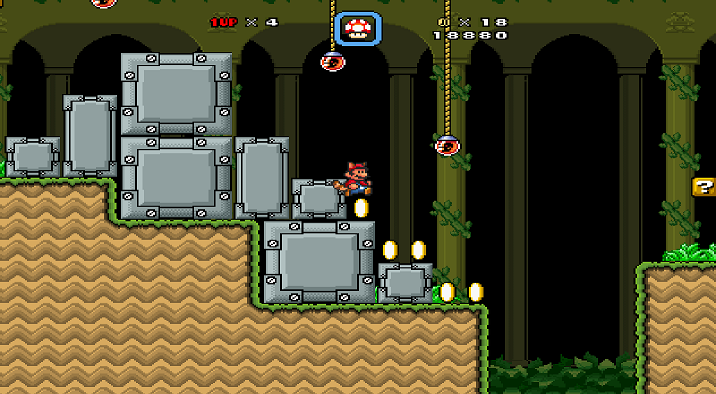
The level will probably need more enemies and I am not sure I like those Metal Boxes, it doesn't seem like they fit to well with the level.
|
|
|
|
|
|
|
|
|
-
Wind
- Chain Chomp

- Posts: 315
- Joined: Fri Dec 20, 2013 12:38 pm
Postby Wind » Sun Aug 17, 2014 11:42 am
I finished the third level of my TOP SECRET PROJECT
click plz
(opinions and criticism are appreciated)
|
|
|
|
|
|
|
|
|
-
bossedit8
- Banned
- Posts: 6838
- Joined: Fri Dec 20, 2013 12:35 pm
-
Contact:
Postby bossedit8 » Sun Aug 17, 2014 12:06 pm
No World Maps?

|
|
|
|
|
|
|
|
|
-
glitch4
- Banned
- Posts: 2577
- Joined: Tue Dec 31, 2013 3:43 pm
Postby glitch4 » Sun Aug 17, 2014 12:23 pm
bossedit8 posts too much that this thread could reach into page 100 again
Wind wrote:I finished the third level of my TOP SECRET PROJECT
click plz
(opinions and criticism are appreciated)
That level is not also creative , but really awesome! Good job Wind!
|
|
|
|
|
|
|
|
|
-
bossedit8
- Banned
- Posts: 6838
- Joined: Fri Dec 20, 2013 12:35 pm
-
Contact:
Postby bossedit8 » Sun Aug 17, 2014 12:39 pm
Too many '?' Blocks... also I have to run because I activaded a P Switch:

|
|
|
|
|
|
|
|
|
-
underFlo
- Wart

- Posts: 4456
- Joined: Mon Jul 14, 2014 10:44 am
- Flair: sup im lesbiab
- Pronouns: They/She
-
Contact:
Postby underFlo » Sun Aug 17, 2014 1:18 pm

An upcoming level for Super Mario Land: The Great Heist. Sizable and Bone Piranha recolor by me.
|
|
|
|
|
|
|
|
|
-
bossedit8
- Banned
- Posts: 6838
- Joined: Fri Dec 20, 2013 12:35 pm
-
Contact:
Postby bossedit8 » Sun Aug 17, 2014 1:26 pm
|
|
|
|
|
|
|
|
|
-
silent_
- Birdo

- Posts: 2151
- Joined: Fri Dec 20, 2013 3:34 pm
Postby silent_ » Sun Aug 17, 2014 1:43 pm
Nickname wrote:
An upcoming level for Super Mario Land: The Great Heist. Sizable and Bone Piranha recolor by me.
Looks pretty neat, man. I like the sinister graveyard atmosphere, and the recolors look great. However, it seems a bit bland at times. Try adding more scenery or coins.
|
|
|
|
|
|
|
|
|
-
underFlo
- Wart
- Posts: 4456
- Joined: Mon Jul 14, 2014 10:44 am
- Flair: sup im lesbiab
- Pronouns: They/She
-
Contact:
Postby underFlo » Sun Aug 17, 2014 1:56 pm
Kep wrote:Nickname wrote:
An upcoming level for Super Mario Land: The Great Heist. Sizable and Bone Piranha recolor by me.
Looks pretty neat, man. I like the sinister graveyard atmosphere, and the recolors look great. However, it seems a bit bland at times. Try adding more scenery or coins.
There actually were coins but I already collected them on the screenshot because I'm smart.
A bonus are, I personally like the Sizable and the grass on the cave ground looks kinda like moss which I like.
I also fixed the cutoff problem Radishl had in other levels.
|
|
|
|
|
|
|
|
|
-
bossedit8
- Banned
- Posts: 6838
- Joined: Fri Dec 20, 2013 12:35 pm
-
Contact:
Postby bossedit8 » Sun Aug 17, 2014 1:58 pm
|
|
|
|
|
|
|
|
|
-
silent_
- Birdo
- Posts: 2151
- Joined: Fri Dec 20, 2013 3:34 pm
Postby silent_ » Sun Aug 17, 2014 2:00 pm
Two more screens of the hub:
Feedback is greatly appreciated, as I'm actually planning to post this top-secret project to the public in the next week or so!
|
|
|
|
|
|
|
|
|
-
underFlo
- Wart
- Posts: 4456
- Joined: Mon Jul 14, 2014 10:44 am
- Flair: sup im lesbiab
- Pronouns: They/She
-
Contact:
Postby underFlo » Sun Aug 17, 2014 2:01 pm
Kep wrote:Two more screens of the hub:
Feedback is greatly appreciated, as I'm actually planning to post this top-secret project to the public in the next week or so!
Lookin' pretty sweet, I only think the torches clash with the cyperspace atmosphere. Maybe add lamps or something or make them look a little electronic.
|
|
|
|
|
|
|
|
|
-
Superiorstar
- Birdo
- Posts: 2153
- Joined: Tue Jul 22, 2014 5:49 pm
Postby Superiorstar » Sun Aug 17, 2014 2:02 pm
Looks good, but I recommend you use the SMB3 recolored custom ruins in Luffy's gfx pack.
|
|
|
|
|
|
|
|
|
-
silent_
- Birdo
- Posts: 2151
- Joined: Fri Dec 20, 2013 3:34 pm
Postby silent_ » Sun Aug 17, 2014 2:05 pm
Nickname wrote:Kep wrote:Two more screens of the hub:
Feedback is greatly appreciated, as I'm actually planning to post this top-secret project to the public in the next week or so!
Lookin' pretty sweet, I only think the torches clash with the cyperspace atmosphere. Maybe add lamps or something or make them look a little electronic.
Maybe I could fix that by recoloring them green? Because I really don't want to remove them; they serve a purpose (and you'll find out why when you beat the game). Anyway, thanks!
|
|
|
|
|
|
|
|
|
-
Radishl
- Guest
Postby Radishl » Sun Aug 17, 2014 2:10 pm
Nick here's some problem with the screenies. The grass part looks wierd with the rest of the cave tiles. And the sizable block doesn't look good on the edge like that. Also try adding a bit more BGO's and grass ect ect.
|
|
|
|
|
|
|
|
|
-
silent_
- Birdo
- Posts: 2151
- Joined: Fri Dec 20, 2013 3:34 pm
Postby silent_ » Sun Aug 17, 2014 2:11 pm
SuperYoshiRex64 wrote:Pivot40Channel wrote:Ghost on mountain.

Riiippp oooffff........
No offense, but it's really dumb to say that, especially when you take graphics from popular levels/episodes too.
|
|
|
|
|
|
|
|
|
-
underFlo
- Wart
- Posts: 4456
- Joined: Mon Jul 14, 2014 10:44 am
- Flair: sup im lesbiab
- Pronouns: They/She
-
Contact:
Postby underFlo » Sun Aug 17, 2014 2:14 pm
Kep wrote:Nickname wrote:Kep wrote:Two more screens of the hub:
Feedback is greatly appreciated, as I'm actually planning to post this top-secret project to the public in the next week or so!
Lookin' pretty sweet, I only think the torches clash with the cyperspace atmosphere. Maybe add lamps or something or make them look a little electronic.
Maybe I could fix that by recoloring them green? Because I really don't want to remove them; they serve a purpose (and you'll find out why when you beat the game). Anyway, thanks!
Fire in general clashes imo. Maybe make it look like these green patterns on the ground?
|
|
|
|
|
|
|
|
|
-
silent_
- Birdo
- Posts: 2151
- Joined: Fri Dec 20, 2013 3:34 pm
Postby silent_ » Sun Aug 17, 2014 2:16 pm
I'm afraid I'm not an advanced enough graphic designer to make it look like the tileset.
Still, I'll see what I can do.
|
|
|
|
|
|
|
|
|
-
underFlo
- Wart
- Posts: 4456
- Joined: Mon Jul 14, 2014 10:44 am
- Flair: sup im lesbiab
- Pronouns: They/She
-
Contact:
Postby underFlo » Sun Aug 17, 2014 2:16 pm
Radishl wrote:Nick here's some problem with the screenies. The grass part looks wierd with the rest of the cave tiles. And the sizable block doesn't look good on the edge like that. Also try adding a bit more BGO's and grass ect ect.
1. The grass part uses the same main stuff as the cave tiles, so it can't not look good as they're basically part of the same tileset.
2. What looks weird? The edges are the same as cave edges.
|
|
|
|
|
|
|
|
|
-
Radishl
- Guest
Postby Radishl » Sun Aug 17, 2014 2:22 pm
Nickname wrote:Radishl wrote:Nick here's some problem with the screenies. The grass part looks wierd with the rest of the cave tiles. And the sizable block doesn't look good on the edge like that. Also try adding a bit more BGO's and grass ect ect.
1. The grass part uses the same main stuff as the cave tiles, so it can't not look good as they're basically part of the same tileset.
2. What looks weird? The edges are the same as cave edges.
I'm not saying it clashes I'm saying it just doesn't look good in the way it is placed. It looks strange. But maby that's just me.
I'm talking about the size able block being at the edge like that. I doesn't look natural.
|
|
|
|
|
Return to “Pit of 100 Pages”
Users browsing this forum: No registered users and 1 guest
|


