Re: WIP Graphics Showcase III
Posted: Fri Nov 17, 2017 3:17 pm
That space tileset is beautiful. I'd really like to make a map with it.
Forums for SMBX
https://www.smbxgame.com/forums/
Well I am planning on releasing this when everything is done. I still need to make all the sceneries, levels, and paths still though.HenryRichard wrote:That space tileset is beautiful. I'd really like to make a map with it.
tbh, i don't like the grainy approach that you put in your GFX, still looks goodPROX wrote:here are some paths:Spoiler: show
With 17 left, I am a little shocked.Maybe lava themed path tiles, hahaha. Looks nice.PROX wrote:ok finished the paths.
Spoiler: show
The blue paths are for the snow.Thx for the idea though. I should make locked paths!TheBossCDA wrote:Nice, are those blue paths supposed to be locked paths or themed paths?PROX wrote:ok finished the paths.
Spoiler: show
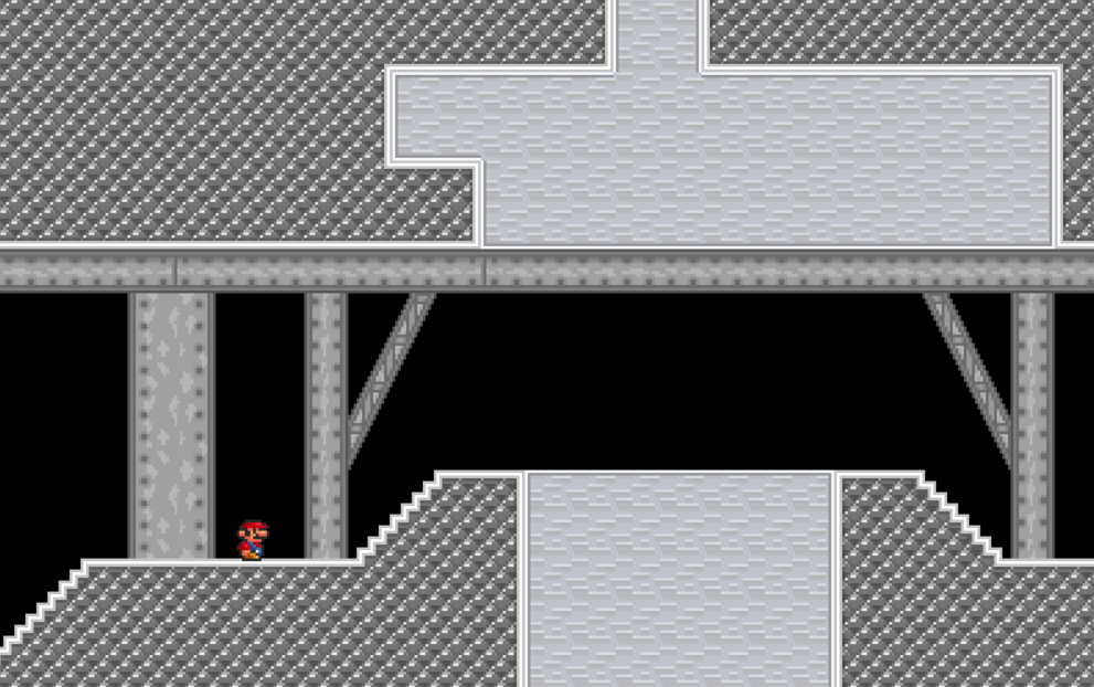
Anyways, I've got a few industrial sets designed for a factory level I'm making. I'm in no ways a graphics designer, but I'd appreciate criticism nonetheless.
Spoiler: show
Thanks for the resource. I made a few changes to fix the pillow lighting on the backgrounds, but I'm finding it a little difficult to avoid banding because of how geometric everything is. I'd also like to add a bit more depth and detail to the beams, particularly the wide one and the supports. Any advice?PROX wrote: Anyway, it's a decent start, but I do see a lot of banding and pillow shading in your tileset. These are things you generally want to avoid when making graphics.
For more information, you can check out this thread. It's very informative: https://forums.terraria.org/index.php?t ... ing.18031/
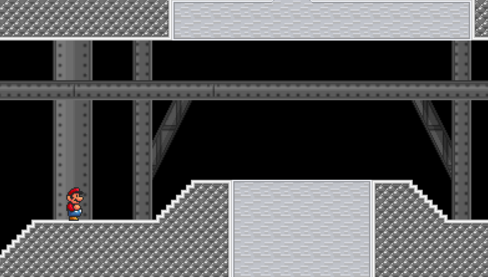
yeah, I would shade those beams somewhere along these lines (I added the texture you included in your old one although normally the middle would be blank):TheBossCDA wrote:Thanks for the resource. I made a few changes to fix the pillow lighting on the backgrounds, but I'm finding it a little difficult to avoid banding because of how geometric everything is. I'd also like to add a bit more depth and detail to the beams, particularly the wide one and the supports. Any advice?PROX wrote: Anyway, it's a decent start, but I do see a lot of banding and pillow shading in your tileset. These are things you generally want to avoid when making graphics.
For more information, you can check out this thread. It's very informative: https://forums.terraria.org/index.php?t ... ing.18031/Spoiler: show

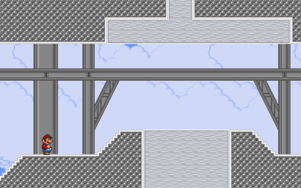
I made some changes and did away with the texture entirely. I don't think I want the backgrounds being too distracting. Besides, the simpler the better, right? What do you think? (Sky background2 added for clarity)PROX wrote:
yeah, I would shade those beams somewhere along these lines (I added the texture you included in your old one although normally the middle would be blank):
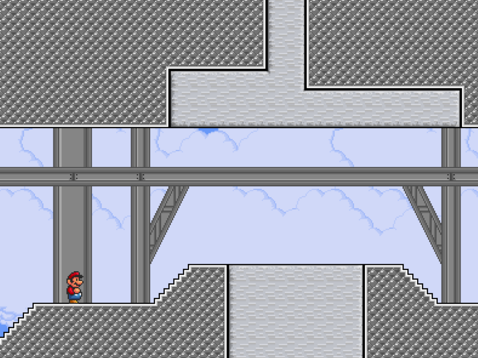
I made a few changes to the secondary tileset and added borders to both. The light source is supposed to be coming from the top right. Where do you see the confusion?PROX wrote:it's better, but the light source is all out of whack now.

i agree, the smw one looks best in my opinion, though i guess it depends on what theme you're going for. the custom palette would work well in a beach environment, for example.Turnip wrote:I'm working on a new tileset, and I need some feedback on which palette I should go with.
I'm kinda leaning towards the SMW one.
personally I really like the custom one.Turnip wrote:I'm working on a new tileset, and I need some feedback on which palette I should go with.
I'm kinda leaning towards the SMW one.

for bothWestretroman wrote:It is a good edit, is it intended for joke levels or a project of yours?