They're not that bad, but they're not that good either.
Moderator: Userbase Moderators
|
|
|
|
-
KingBowser24
- Tweeter

- Posts: 126
- Joined: Mon Nov 16, 2015 9:31 pm
- Flair: Master Procrastinator
Postby KingBowser24 » Mon Dec 28, 2015 3:06 am
Well, this is the level i was going to enter in the cancelled Subcon level contest.
Basically, this is one big level made of three mini-levels, each "Mini-Level" having a boss fight.
Being a SMB2-Themed level, the bosses are Birdo, Mouser, and then Wart at the end.
Stats (Estimated):
Length: Long-ish
Difficulty: Medium
EDIT: Heres a WORKING link! Sorry about that.
https://www.dropbox.com/s/c1tl4po2wojo8 ... a.zip?dl=0
Here we are. Now I'm not exactly a great level builder, but I spent alot of time on this level and i hope its worth it 
Note: There are actually no powerups, much like in SMB2 itself, aside from the Starman, which is not in vanilla SMBX.
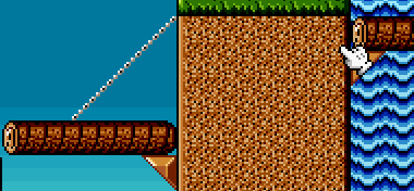
Oh, where are my manners, heres the screenies :
Last edited by KingBowser24 on Mon Dec 28, 2015 10:36 pm, edited 1 time in total.
|
|
|
|
|
|
|
|
|
-
SecondScolipede
- Flurry

- Posts: 184
- Joined: Tue Mar 17, 2015 9:12 pm
Postby SecondScolipede » Mon Dec 28, 2015 6:34 pm
What is up with the saturation? All of the colors look ither too dark or too strong. It's like Subcon is going through an eclipse.
|
|
|
|
|
|
|
|
|
-
KingBowser24
- Tweeter
- Posts: 126
- Joined: Mon Nov 16, 2015 9:31 pm
- Flair: Master Procrastinator
Postby KingBowser24 » Mon Dec 28, 2015 10:39 pm
I just think it looks a little cooler,but it could make sense, after you beat mouser and leave his lair the skies will be grey, and at one section theres even a lightning storm happening 
Also, much of the level is underground or inside a boss's lair, so I was actually trying to make most of the level appear darker.
Oh, and the download link works now! Sorry the last one didnt.
|
|
|
|
|
|
|
|
|
-
KingBowser24
- Tweeter
- Posts: 126
- Joined: Mon Nov 16, 2015 9:31 pm
- Flair: Master Procrastinator
Postby KingBowser24 » Sat Jan 30, 2016 4:35 pm
I'd really love a review, or at least some feedback on this. Ive been waiting patiently for over a month for any feedback, and I spent alot of time on this level. I havent really gotten anything on it besides the comment on the graphics 
|
|
|
|
|
|
|
|
|
-
Cheeyev
- Blooper

- Posts: 166
- Joined: Tue Jan 19, 2016 9:55 am
-
Contact:
Postby Cheeyev » Sat Jan 30, 2016 7:03 pm
Well, I tried it out, and I can say it's pretty good! I'm no reviewer, but I'll talk a bit about some things I have to say about this level. I would have some screenshots, but the screenshot function isn't working for me, so I'll just talk about the sections themselves.
Section 1 - The saturation on the blocks and sprites is kind of odd if you ask me.. They look extremely dark compared to the other graphics. Also, I think those are 1x1 pixels on the clouds.
Section 2 - I can see a bit of the original SMB2 layout in there before it becomes new. Also, you may want to use Sednaiur's SMB2 expanded GFX-Pack.
Section 3 - If you squint, you can see the resemblance of the interior of SMB2's vases. But really, you still may want to use his expanded GFX Pack to make it look much more like a vase. Anyways, I think Birdo appearing could be better executed, like there's a key when you enter it, and then upon touching it, Birdo is summoned and fights you. I also like how the vase explodes when you activate the switch after Birdo is defeated.
Section 4 - You can easily skip the "downwards elevator" section by jumping on one of the two corner blocks, but it'll become a very blind jump if you do so. I do like the touch of using bombs to blow up the blocks to get inside.
Section 7 - The lightning is very poorly executed, it feels like it could give people seizures at any moment.
Section 11 - I can barely see the background, and like with the other sprites, Wart has very odd saturation.
Besides that, it's pretty okay!
|
|
|
|
|
|
|
|
|
-
lighthouse64
- Charged Spiny

- Posts: 1804
- Joined: Sat Apr 26, 2014 6:28 am
Postby lighthouse64 » Sat Jan 30, 2016 8:16 pm
Woohoo I'm going to do another level review. 
Ok. So here's the total score:

yes, I gave it to you as a report card
Here's why.
Gameplay:5
weight-50%
-It's not very difficult, and the whole level is very straightforward.
+I liked how you used elevators that accumulate npcs along the way. They were placed well.
+I also liked the vines with mutiple hoopers, and how you had to switch vines quickly to avoid being damaged.
-All of the boss battles were pretty standard. And the high placement of mouser and the wart made it a lot easier.
-The npcs really weren't really adding much effect in most places, except for the elevator. (This includes all of those radishes)
-Too many mushrooms made the level too easy.
-The pow block did nothing.
Graphics: 1.5
weight-40%
This is going to get rough here.
-tons of clash. I'll point it out in some areas.
You didn't saturate every part. The small trees, clouds, rugged looking blocks, bomb men, hoopers, small pipes, window ropes, coins, masks, spikes, radishes, doors, the pow block, radish spewing machine, toad, the tnt pressing block things, chains, vines, thrones, red grass patches, and grass patches weren't saturated at all, and they still had their old coloration.

There were quite a few areas where the objects didn't match the theme.
First of all, I can start with this area.
The smb1 triangle block things weren't necessary, and messed up the theme, along with the chain.
(This mistake can also be seen in the suspension bridge)

Then this area.
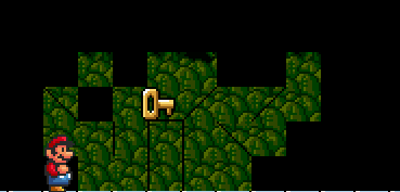
Please please please use an actual door, and take the time to actually shade it. And also the key didn't fit in well with the smb2 atmospere.
What is this? That block, and that cheep cheep just stick out. no. Get a graphics pack and make it so that the blocks share the theme. (This applies to all of the bloopers and pipes in the level as well)

The smw doors, signs, the spring, the wheel spinny thing, and the checkpoint attract negative attention. Make sure that they can match the coloration of the surrounding area.

Last thing I have to point out. The clouds need to look more pixilated. They don't really look like they belong in a 16bit level.
+Despite the fact that the graphics hurt my eyes a bit, I like how you took this level into a new perspective and made it look darker.
+The backgrounds fit in well.
-I don't think you should use saturated themes anymore though. You forgot to saturate several items.
Music:9
weight-10%
I'd say that the whole time the music was used well. The music for the underground area sounds a bit creepy though.
I hope I did a good job reviewing.
|
|
|
|
|
|
|
|
|
-
KingBowser24
- Tweeter
- Posts: 126
- Joined: Mon Nov 16, 2015 9:31 pm
- Flair: Master Procrastinator
Postby KingBowser24 » Tue Mar 01, 2016 12:08 am
Thanks for the reviews guys! They both sound pretty accurate to me.
And now, we wait on an official review....
|
|
|
|
|
|
|
|
|
-
glitch4
- Banned
- Posts: 2577
- Joined: Tue Dec 31, 2013 3:43 pm
Postby glitch4 » Thu Mar 24, 2016 2:48 am
Title: Subcon Road
Designer: KingBowser24
The level was average. The saturation was pointless and I didn't like it, because you didn't saturate some objects, like SMB1 grass, SMW sign and other ones, which they don't really fit without saturating. The level design was pretty decent, the construction was fine for some point and I like going through various themes. There's some creative effort, like destroying a block to make NPC fall down, and going down/up with some emenies falling down from pipe. The length of this level is fine, but it felt easy to me. The bosses are way too easy to beat, so put some emenies in their battle section. I don't think the music fits in section 7,8 and 9,none of them are boss sections and they should've changed in my opinion. Anyways, the music was fine in other sections.
Allright before finishing, time for some errors:
- This screen shows 3 cutoffs, no placed vine ends, and that cutoff on the top should be fixed by placing a block on it.
- This screen shows that you shouldn't place grass tiles like this, because they have corners and they don't fit good.
Design: 5/10
Creativity: 6/10
Aesthetics: 3/10
Total: 14/30 -> 4.6/10
|
|
|
|
|
Return to “Average”
Users browsing this forum: No registered users and 1 guest
|


